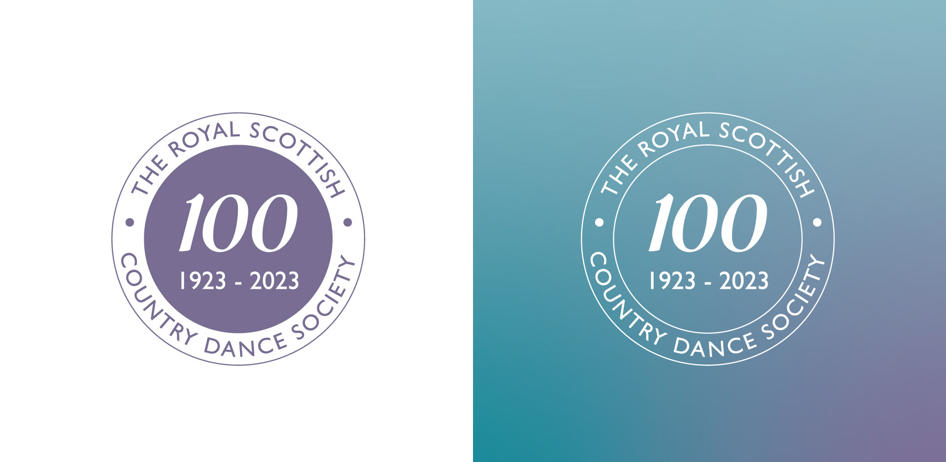
The brief for this Centenary event was to create a cohesive brand, supported by illustrative elements that evoked feelings of nostalgia. As The Royal Scottish Country Dance Society was founded in the 20s, it seemed fitting to seek inspiration from that era for a set of key location posters; Glasgow (where The Society was founded), St Andrews (the home of The Society's flagship event, Summer School) and Edinburgh (The Society's Headquarters).
The font Gill Sans was chosen for its timeless appeal, as well as legibility. The soft gradients throughout reflect the changeability of the Scottish weather and the colour palettes are deliberately bright and eye-catching to capture the essence of screen printed railway travel posters from the past.